Only A Mouse Can Be Simply Gray: What’s Your Color?
Color secrets
Or why do you need theory…
Color is one of the main components in the formation and perception of your image.
Interestingly, the word ‘to see’ in many languages has two meanings (‘to see’ and ‘to understand’). For example, “I see you are wearing a beautiful dress today”
or, “I see you decided to change the style and stopped wearing dresses”.
It means that image always consists of both visual perception of color and its mental, psychological, and aesthetic components. Probably, that’s why we choose a new thing so carefully, bringing it close to the face, carrying it out of a dressing room and exposing to bright light, or sending an MMS to our “reliable consultant”. But often we make a number of mistakes concerning colors, and unloved things in our closets remain us about it with silent reproach. Why does it happen so? Let us not dump all the blame on those who advised to buy this piece of closing but take responsibility and admit that you don’t know the theory. To say in simple words – you don’t know how a particular color behaves when creating your image.
The main mistakes in color selection
- Choosing “alien” colors. That is, colors that do not match your natural look, determined by the color of hair, eyes, and skin.
- Mistakes in choosing color contrast. The colors around are much more active and brighter than your appearance (we will talk about the contrast next time).
- Inharmonious color combination (when one color neutralizes or distorts another one).
How to avoid choosing the wrong color?
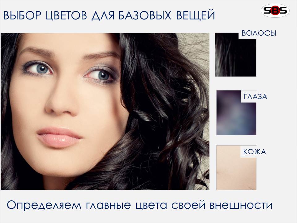
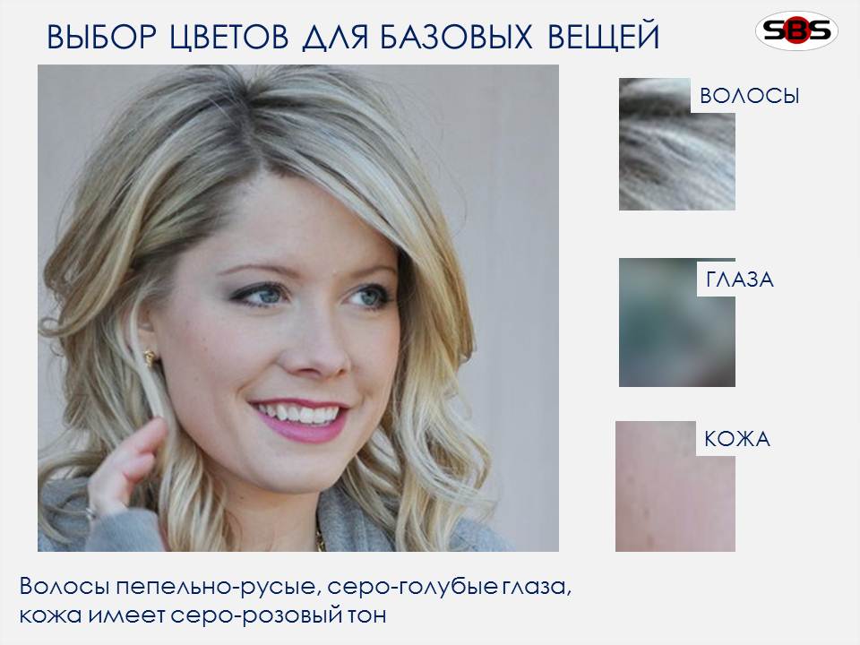
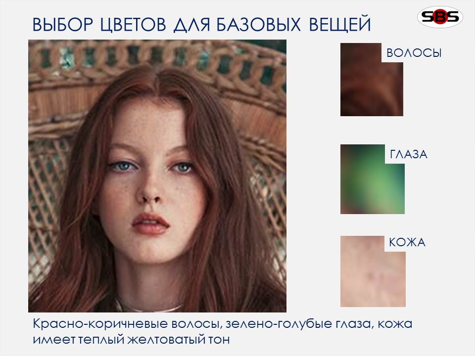
- Look closely in the mirror in daylight. Identify your eye color exactly to the nuances (e.g, brown-green, blue with golden dots, emerald with a turquoise tint). The more precisely you define a color, the more beautiful (and – harmonious) your image will look.
- Do the same with your hair color, defining it at the root (2-3 cm).
- To determine the color, additional tools are needed sometimes – the shawls of cold pink and warm salmon colors. Apply each of headscarves by turns to your face and look, with which it looks fresher. If it’s pink scarf, your skin has cool color, and it has more gray pigment. If salmon color fits you more, then you have warm coloring, and your skin is of peachy, golden or yellowish tone.

Gray which isn’t gray
Despite the fact that gray is proposed in only one of the options of color typecasting, it can be used as the main color for all types. It is the color of elegance, ambiguity, and intelligence. As research show, unlike chromatic colors, it doesn’t cause emotional reactions. Therefore, it is considered the perfect backdrop, which can be deployed any action. However, getting rid of “emotion” this color is bounced back to rationality. It abhors cheap fabrics, cut errors, curves lines, or failed styles. It is literally uncompromising.
And again: combining gray with gray is a real pleasure! Choosing a chromatic color to gray, you need to keep in mind the degree of contrast of one’s own image and a rule from my stylist experience: no simple gray color. Either deep heavy gray (metallic look) or air light-gray (as the sky in March). Only a mouse can be simply gray… 🙂
Focusing on its natural flavor, look at the examples below. Pay attention to our slider – one of the options will be yours.
Love, S. Brusylovska
[masterslider id=”16″]
 (2 оценок, в среднем: 5.00 из 5)


